Project Summary: Discovering Extremadura is an online shop that offers Tourist Experiences in Extremadura. This website is one of the main income sources of Sertumon S.L., a Spanish company located in the region of Plasencia (Cáceres)
Major Task & Responsibilities: Redesign the website with a better and easier navigation architecture, identify the key tasks, set usability goals, develop a prototype and run a usability test with some stakeholders on the design. Build the website accordingly following the results from the usability test.
Platform: Responsive Website
Design Tools / UX Methods: Card Sorting, Paper prototypes, Sketch.
Development Tools: WordPress, CSS3 & PHP
Key Performance Metrics: Optimal Workshop metrics.
The Problem
The Discovering Extremadura website had a very complex navigation system with a lot of categories. The shopping experience also suffered from poor usability.
The Solution
The managers of Discovering Extremadura wanted to redesign the website with a more user friendly design.
My Role
UX/UI designer, Web design and Development.
Tools
Card Sorting (Optimal Workshop), Affinity Designer (Design the website), Pen and Paper (paper prototyping), WordPress.
DEFINE
Strategic objectives
Discovering Extremadura needs all the work done for the new website.
Requirements
They company decided on a new website where people can buy packets of experiences, hotels and events. The new website will allow an user to buy services and products online.
Business Goals + User Goals
A new easier architecture, a friendly user centred design. The card sorting and the usability testing will surface the user needs and the changes the online shop will need to meet them.
DISCOVER
Card Sorting
I created a Card Sorting exercise that has been completed for 10 people, age range 25- 60 to evaluate the best architecture to show the categories and products in the website.
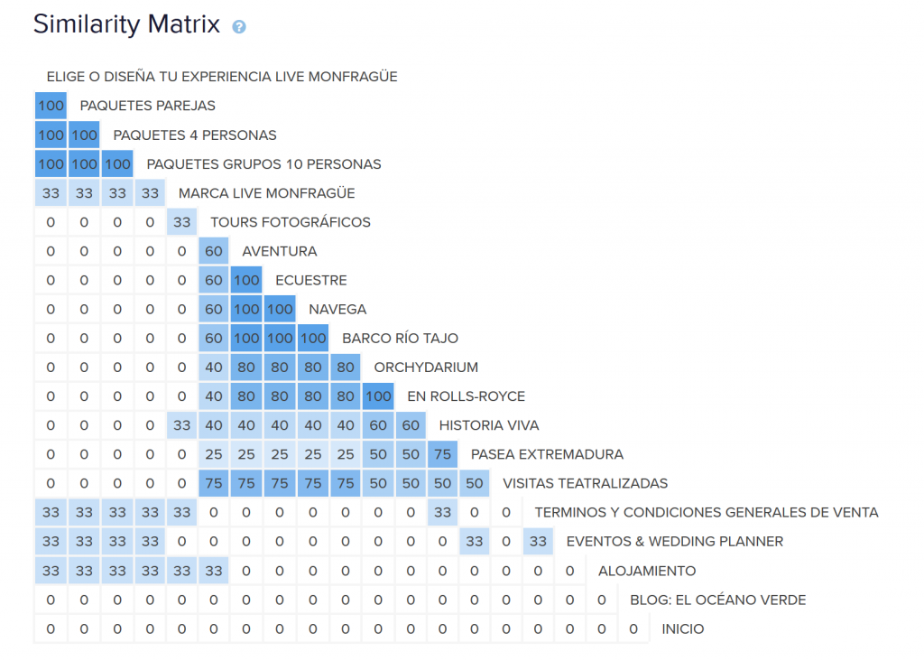
The Card Sorting showed the following:
- The users have made two large groups with more than 3 subcategories each. On one hand the related activities / experiences and on the other hand the group for packages.
- Analyzing the names of the categories we can also find a variety of options, especially in the two main groups. The first one Activities / Experiences and the second group Groups offers / For who.
The similarities by elements are shown in the following table:
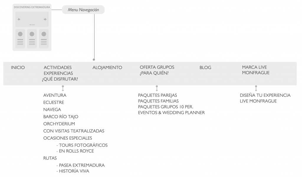
In the follow diagram you can see the final architecture navigation.
DESIGN
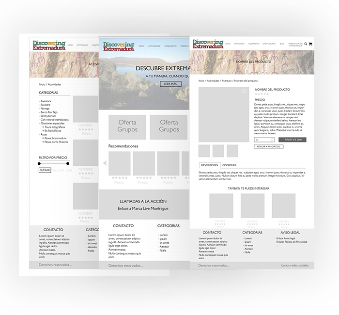
Wireframes
I drew out several low fidelity prototypes by paper and perform usability testing with different stakeholders.
DEVELOPMENT
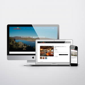
I developed the website with WordPress. I created the website following the design of the prototypes and focusing in get the functionality as good as possible. I have feedback and observations from the stakeholders with a few small modifications.
OUTCOME
Learning:
I put my UX knowledge into practice: Defining and developing Card Sorting exercises in each part of the process. Design a clean and simple website through iteration. From an idea to a real website.
Insight on user research:
Despite the differences between the users, this group mostly shared the same goal despite that seeming somewhat unlikely at first.
Challenges
Dealing with management to get approval to conduct initial Card Sorting, and persuading them successfully of the benefits of user research.
Favourite part of the process
Sketching and developing Card Sorting. It was very fulfilling to see the result from the user with the Optimal Workshop tool. I ended the project feeling more confident creating Card Sorting exercises.