Visual aesthetics and emotions
One of the most important parts in the early stage of the design process is to focus on the functional aspects of a design, and to conduct research to ensure that the overall solution offers a compelling value proposition to users. For this reason we give a lot of attention to optimising usability, making the product easy for users to realize the solution’s benefits and, ultimately helping them to achieve their goals.
However, the emotional aspect of the design, the aesthetics, look and feel have always been left in the hands of the designer’s beliefs or decision-maker of the company. Visual design itself often comes with an aura of subjectivity that is difficult to measure and control. Visual elements can support a solution’s interaction design, but they can also trigger an emotional response from the user. Understanding and exploiting these emotional responses can help designers to influence users appropriately.
This is especially important in the creation of the first impression, where user are more influenced by their initial emotional response to a product’s visual aesthetics and imagery than the functional aspects of the product. For example, if a user has a positive first impression of the design aesthetics, they are more likely to overlook or forgive poor usability or limited functionality.
You might think that conceptual approaches though user feedback and usability testing can give you answer to their emotional responses. However participants tend to rationalise their opinion based on their personal taste and it may not be related to the business, or they may have difficulty articulating what it is about a design they like or dislike.
There are many different research methods that are trying to solve this problem, such as Triading, the 5 Second Test, questionnaires such as SUS, QUIS, WAMMI… Each one has its advantages and disadvantages depending of the particularities of the study.
The versatility of Desirability studies
One of the methods that demands more attention for its simplicity is Desirability studies. Desirability studies are a great way of understanding the aesthetic and visual design directions you may be considering and ultimately measuring the intangible aspects of the user experience.
This method was introduced by Joey Benedek and Trist Miner and first implemented in the form of the Microsoft Reaction Card Method. They developed a set of adjectives (118 cards*) that participants could use to describe their reactions to a visual design. These adjectives represent a mix of descriptions that people might consider positive or negative.
The process consists of showing the participants one or several different visual design directions (e.g. High-level designs or Mood boards) or visually designed interfaces (e.g. High-fidelity mock-ups of home pages) Participants are then asked to select between three to five word from a list that best describe the different designs.
To adapt this methodology to focus on visual appeal it’s recommended to modify the list of words. Which words you include depend on what you’re interested in measuring (For example, remove the words that are only relevant for functionality content focusing on words that describe more the visual aesthetics). Reducing the list to around 25 or less would be best, and choose a variety of words: negative, neutral (40%), and positive (60%). If possible, randomise the order in which the words are presented.
Desirability studies can be used as a qualitative or quantitative method. Qualitative desirability study can help to uncover more insights with posterior questions to the participants about why they picked each of the words and what means for them these words. On the other hand, the Quantitative desirability method was an adaptation through surveys allowing you to get more representative samples of the target audience.
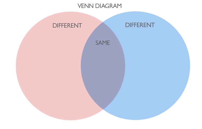
To analyse the data from a qualitative approach, select the most used words or adjectives from each visual design. The best way to show the results is with a Venn diagram. Each circle represents a different visual design and the overlap between circles contains the attributes that are shared in common. The result is positive if the attributes align with the business’s intended emotional response.
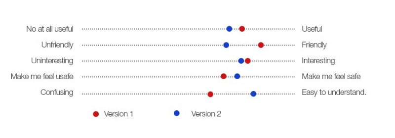
If you choose a quantitative approach, the best way to analyse the data is paired opposites in the survey, which allowed you to show the results more visually.
I hope this article gave you some ideas about the advantage of using desirability studies, and how they can be implemented. Please let me know your thoughts!
* Link to the list of adjectives: https://www.nngroup.com/articles/desirability-reaction-words/