Project Summary
The management of Bingley Little Theatre want to renew the current website, and make it more user friendly and clear. My role was to research, design and develop the new website. As it was a voluntary project, I worked on both the user research and website design without a budget to hire additional staff.
Major Tasks & Responsibility
Carry out use research to discover if there was a user need for a new website. Identify the key user groups, identify the key tasks, set usability goals, develop a prototype, show it to the management, iterating on the design and develop the new website.
Platform:
Responsive website
Design Tools / UX Methods:
Competitive Analysis, Affinity sorting, Personas, Storyboarding, Prototyping with Axure.
Developer tools:
WordPress (PHP, HTML5, CSS3), Photoshop…
The Problem
Recently the management of B.L.T have received a lot of complaints about how difficult it is to use the website, specifically in mobile devices and also the webmaster complained about how difficult it is to update the website with the current system.
The solution
A modern responsive website, centred in the user needs, will make it easy to find information for users and also help the webmaster to make changes thanks to a CMS platform.
My role:
UX/UI Designer, developer
Tools
Prototyping with Axure RP8, paper storyboarding, etc.
DEFINE
Strategic Objectives
The management of B.L.T wants to develop a new website adaptive to all devices, easier to use etc.
Requirements
They want an easier way for users to buy tickets for the plays and an easier way for the staff to upload new information in the website.
Business Goals & User Goals
Develop a better user experience in the website with a more modern system or platform.
DISCOVER
Competitive Analysis
I researched 25 Amateur Theatre websites located in the UK with a live website. After I analysed the main competitors in terms of proximity and online systems to buy tickets. The main competitors are Ilkley (Ilkley Play House), Keighley (Keighley Play House) and Halifax (Halifax Play House). After that I conducted comparative benchmarking.
User Research
I interviewed 8 people, age range 27 – 65 to evaluate the need in the current website. I recorded the interviews to focus on how users move through the website. It showed the following.
- 5 users were confused by different sections when they tried to find information on the menu.
- 6 users mentioned that the website is busy (as in a lot going on)
- 6 users mentioned that the pictures are quite good.
- 7 users mentioned that the website is old fashioned and not user friendly.
Affinity Sorting
I used affinity sorting and the following worksheet to analyse the data.
Personas
4 groups stood out:
- People with low familiarity with Tech and low experience of the Theatre.
- People with high familiarity with Tech and High experience of the Theatre.
- People with low familiarity with Tech and High experience of the Theatre
- People with high familiarity with Tech and low experience of the Theatre.
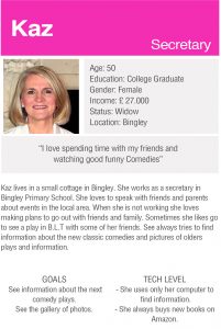
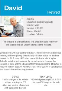
My primary persona is Kaz, my secondary persona is David. In order to please tech savy users, an update could be make the process to buy tickets in mobile devices responsive and faster.
Based on the user research, I discovered the needs of the following features:
- See the Play List
- Buy Tickets online
- See detailed information of a play (time, price…)
- Upload new plays in the website
- Find information about Bingley Little Theatre
- See a gallery of photos for the latest play.
I created the red routes for the website and 2 scenarios based on my primary and secondary personas and the user story.
| Red Route See the play list | Kaz says: As a customer, I want to know the next plays in the area, so I can choose the funniest and by tickets for me and my friends. |
| Red Route Upload new plays in the website | David says: As a webmaster, I want to upload a new play for next week from my tablet, as I’m not at home. |
DESIGN
Information Architecture
I created a card sorting exercise with 8 users to know what the hierarchy and labels of the sections in the website were. I also wanted to analyse the best approach to organise the plays, by category or time of the play. The exercise showed me that the best approach is by time of the play.
Sketches
I drew out the main screens that Kaz and David would need to accomplish their goals for both scenarios.
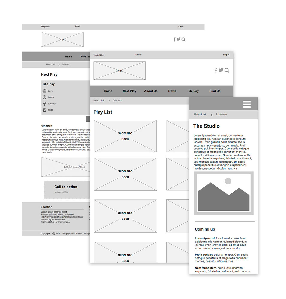
Wireframes
I created an interactive prototype for Kaz and other for David. I sketched out all the screens based on the list of features to help the users achieve their goals.
Usability Testing
With all the screens ready, I performed testing with 2 users, age ranges 35 – 65 (one for the front website and one for the back website).
I wanted to test if my design was as clean and uncluttered as I thought and check if someone without advanced knowledge in computers could upload a play in the website.
Some observations and modifications after the test:
Consumer
- The price needs to be bigger and darker.
- Add other information about discounts for groups.
- Add information about what time is the break on the play.
- That the location links to Google Maps
Webmaster
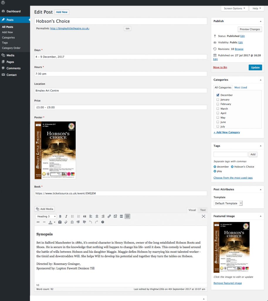
- Inside the CMS, the title of the field “Book” wasn’t clear enough.
Sadly, under instruction from the Committee, the time I was able to spend with users before development was limited so a decision was taken to move onto the next phase; development.
DEVELOPMENT
I developed the website with WordPress. I created the website following the design of the prototypes and focusing in get the functionality as good as possible. I have feedback and observations from the new Committee and users from ongoing testing that have been incorporated into the design, and I’m awaiting approval at the moment to do a final round of dedicated user testing before the website goes live.
OUTCOME
Learning:
I put my UX knowledge into practice: Define a user need, Discover how to solve the user’s goals, Design a clean and simple website through iteration. From an idea to a real website.
Insight on user research:
Despite the differences between the users, this group mostly shared the same goal despite that seeming somewhat unlikely at first.
Challenges
Dealing with management to get approval to conduct initial user testing, and persuading them successfully of the benefits of user research. Some members of the committee immediately understood the benefits of user guided design, whereas some were resistant.
I had to use a combination of empirical evidence and persuasive skills to help explain to some initially hesitant committee members, of what user guided design principles could give in terms of benefit to the finished website.
Favourite part of the process
Sketching and developing prototypes. It was very fulfilling to iterate on designs and test them directly on users. I ended the project feeling more confident.